
· By Spencer Hardegree
The Definitive Ranking of the Worst Soccer Club Logos (That Somehow Exist)
There are bad logos, and then there are soccer logos so hideous, they deserve a yellow card for crimes against design. In a world where football is worshipped like religion and kits are worn with pride across generations, how these logos made it past a single design meeting is a question that may never be answered. But we will not stand silent.
We are going to expose the most aesthetically offensive, visually incoherent, and flat-out embarrassing club crests to ever disgrace a pitch. These are not just unpopular opinions. These are facts, etched in poorly drawn line art and typographic abominations.
Let’s get controversial.
1. Juventus (Post-2017 Logo)

Let’s just get this out of the way. Juventus decided one day to throw over 100 years of history into the bin and slap a minimalist “J” on everything. It looks like an app icon. A cereal box. A failed tech startup. The once-majestic zebra crest has been replaced with something that wouldn’t look out of place in a dental floss commercial. This was not evolution. It was a corporate rebrand masquerading as innovation. It’s modern only in the way your dad thinks TikTok is “trendy.”
2. Leeds United (2018’s Almost Logo)

Yes, it was pulled before release. Yes, they claim it was just a concept. But the fact that someone, somewhere, thought “a man fist-pumping his chest like a Pepto-Bismol ad” was the future of Leeds branding is an unforgivable sin. It looked like clipart from an Xbox Kinect game menu. The internet’s collective meltdown forced the club to reverse course. But we remember. We always will.
3. MLS's Chicago Fire (2019 Logo)

The original logo? Not amazing, but passable. The 2019 redesign? A visual war crime. A crown of flames that somehow looked like a hastily drawn compass rose? It had no connection to the city, no soul, and no fire. Just awkward angles and colors that looked like they came from a box of melted crayons. Even the players looked uncomfortable wearing it.
4. Cardiff City’s “Bluebird-Dragon” Frankenstein

Pick a side. You can’t be both a bluebird and a dragon. Cardiff tried to appease two groups of fans by smashing a delicate avian with a fire-breathing mythical beast, resulting in a logo that looks like a mid-level mobile game icon. It’s a compromise that satisfied no one and offended everyone. Design by committee at its absolute worst.
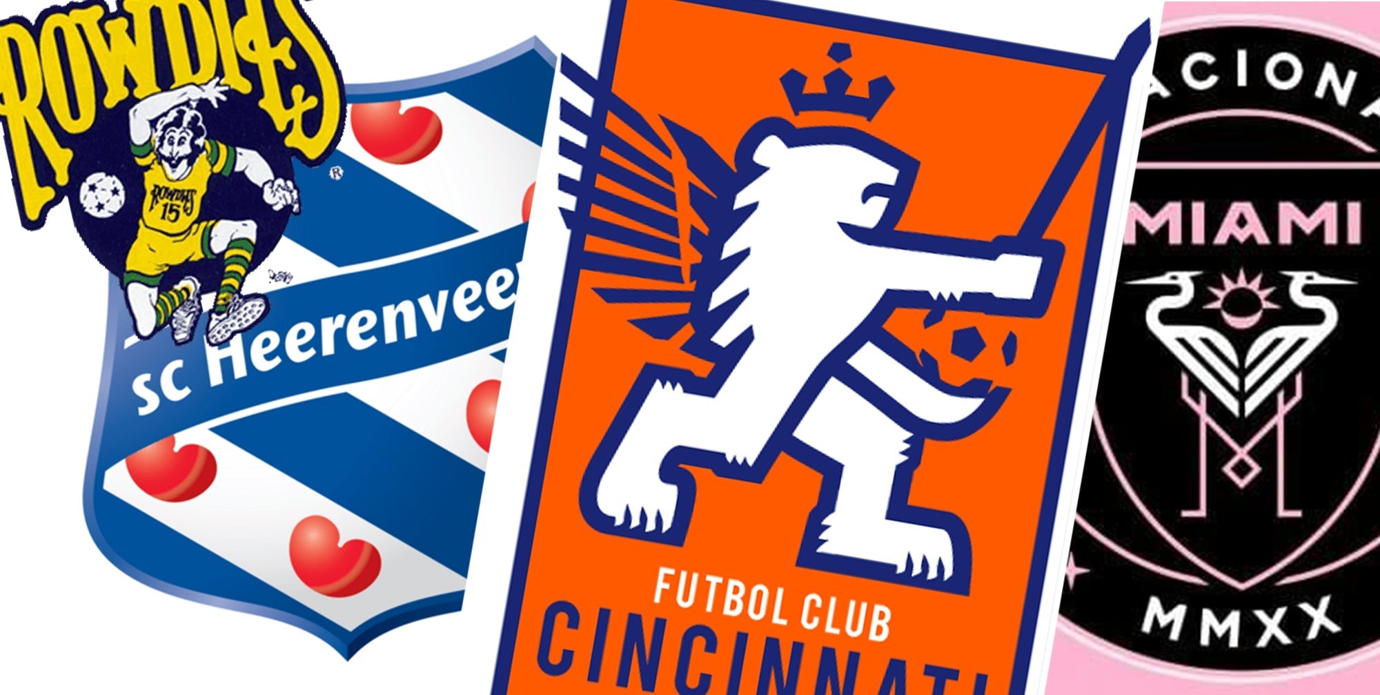
5. FC Cincinnati’s Sword-Wielding Lion Disaster

Imagine trying to explain this logo to someone who’s never seen it. “So it’s a lion, but he’s holding a sword, and he’s on fire with Dutch typography, and it’s vaguely medieval?” What should be bold and knightly ends up looking like a school mascot went rogue. The angles are weird. The typography is confused. The lion looks constipated.
6. Pumas UNAM (Mexico)

Before you come for me, yes, it’s iconic. But also, it looks like a badly drawn cat head inside a Dorito. There’s something deeply unsettling about the geometry of it. It’s not fierce, it’s not majestic, it’s… weird. The eyes haunt me. It feels like the logo was designed on a TI-83 calculator.
7. Norwich City’s Canarian Catastrophe

There is a bird standing on a ball. With a castle behind it. And a lion that looks like it was drawn by a toddler on a sugar high. The Norwich badge is a fever dream of local symbolism with no visual hierarchy. It feels like a medieval coat of arms done in MS Paint. Bold? Sure. Good? Absolutely not.
8. Crawley Town FC’s Horror Collage

Two clipart figures, a soccer ball, a cross, and what appears to be a haunted house. It’s like five unrelated icons were jammed together and told to coexist. There’s no cohesion. There’s no grace. Just unfiltered confusion. If you told me it was the poster for a low-budget horror movie called “The Penalty Box,” I’d believe you.
9. Inter Miami’s Flamingo Touchpoint of Madness

David Beckham, how did you approve this? The herons look like they’re awkwardly neck-fighting. The M logo is trying to be sleek but feels cheap. It’s supposed to be elegant and Art Deco, but ends up as a failed tattoo design. The best thing about this crest is how many parody versions it inspired.
10. LASK Linz (Austria)

A badge that says, “We couldn’t decide what our name should be, so we used all fonts.” The shield is plain, but the font choice ruins everything. It looks like it belongs on a fourth-tier German beer label. You don’t get points for simplicity if your typography looks like it came from a free clipart CD.
11. SC Heerenveen (Netherlands)

Yes, hearts. We get it. But this badge looks more like a Valentine’s Day card than a soccer logo. The colors are pure chaos and the stripes are more circus tent than competitive sports. Opponents are not intimidated, they’re confused. Are they about to play a match or receive a bouquet of flowers?
12. Al Hilal (Saudi Arabia, Pre-2023)

Soccer ball? Check. Crescent moon? Check. Bad proportions and visual clutter? Double check. This logo had the energy of a middle school space club. Everything is trying to be the focal point and ends up canceling each other out. It’s not terrible by accident, it’s terrible by ambition.
13. Tampa Bay Rowdies (NASL Era)

Fonts matter. And when you make your entire logo a jagged, jumbled mess of 70s disco type, you get what can only be described as a crime against branding. The “W” and “D” were physically painful to look at. It felt more like the label of a root beer bottle from 1973 than a soccer team.
14. Any Club That Still Uses a Soccer Ball Clipart as a Main Feature

We’re looking at you, lower-tier teams across the globe. If your logo is still just a ball with some stars and your initials awkwardly floating around it, please. Stop. You are better than this. Or at least we want to believe you could be.
Why This Matters (And Why We Care So Much)
A logo is more than decoration. It’s pride. It’s history. It’s the first thing you see when a team lines up on the pitch. These crests represent the cities, the fans, the legacy, and when they fail this hard, it’s more than an eyesore. It’s an insult.
Fans deserve better. The beautiful game deserves better.
If you’re a designer working on a rebrand right now, this list should haunt your dreams. Never let corporate design committees ruin your club’s soul again. Protect your crests. Protect your legacy.
And for the love of everything holy in football… leave the flamingos out of it.
